What happened to income inequality in Spain during the pandemic?
Ángel Martínez
29 Jun, 2023
Key Ideas
→ 80% of households lost purchasing power during the pandemic (between 2019 and 2021) in real terms.
→ Inequality was reduced over the same period thanks to large income growth among the poorest 10% of households.
→ Half of this increase in income is explained by the growth in the coverage rate of the minimum income system.
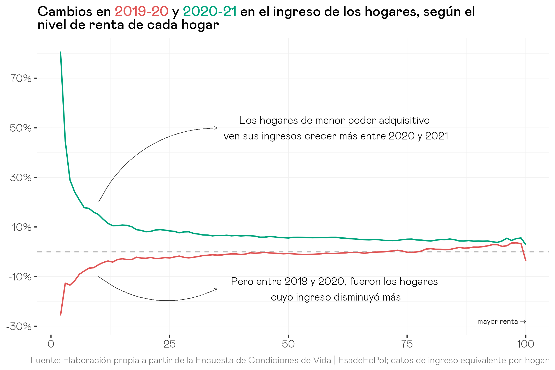
The three-year period from 2019 to 2021 has probably been one of the most chaotic so far this century, pre-pandemic, pandemic and post-pandemic respectively. The sheer number of policies, headlines, announcements and trial balloons that were launched throughout those three years make it necessary for us to take a small step back to try to get a good understanding of how income distribution changed during those years and why. In other words, to see what was the total distributional balance of the pandemic and post-pandemic on the income of Spanish households.1 The following graph reflects what happened in Spanish society during those years. First, we order individuals according to their position in the income distribution, which is determined on the basis of the equivalent household income, which takes into account the composition of the household.2
The graph shows us the fall and recovery of household income in Spain according to their position in the income distribution, dividing all households into one hundred identical groups with 1% each (about 470 thousand individuals in each). We can observe by following the red line that, during the pandemic, it was the poorest households (the poorest 33%) who lost income as a consequence of the crisis, while for the remaining 66% of households the year 2020 was a year without a significant change in income except for members of the top 10%, who made gains of between 2% and 3%, with the notable exception of the top 1%, who lost 3.6%. The situation in 2021 is the opposite, with much stronger income growth among the top third of the poorest households, especially among the bottom 10%, who not only gained income that year, but managed to recover all that was lost during the pandemic. The aggregate balance for each percentile between 2019 and 2021 is especially positive for poor households, especially among the bottom 5% of households.
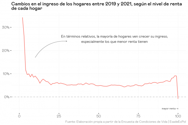
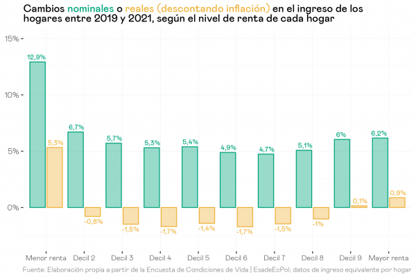
Since the first percentiles of the distribution scale up considerably, let’s group households a bit more and look at the change between 2019 and 2021 for deciles (ten groups identical in size with 10% of people in each: 4.7 million or so), recalling that a decile is nothing more than the grouping of its ten corresponding percentiles. The story is clear: a large part of Spanish households have seen their income grow between 5% and 6% between 2019 and 2021, but those households that were part of the 10% with the least resources have experienced a much higher growth of 13%.
Before going into the causes of this large increase in income for poor households, it should be clarified that these increases in income are merely nominal and, therefore, do not discount the strong inflation that households experienced during 2021. Inflation in 2021 was, moreover, a substantially different inflation between rich and poor, as shown in this post I wrote together with Natalia Collado. To approximate the real effect and compare it with the nominal one the following graph deflates the inflation experienced in 2021 by each decile to obtain income growth in real terms. The reason for not including inflation for the 2019-2020 period is because we do not have that data by deciles, and because the differences would surely be minimal considering that average inflation in that period was only 0.3%. Once inflation is taken into account, we can see that most deciles lose purchasing power, with the exception of the poorest 10%, which continues with gains of 5.3% in real terms, and the top 10%, which shows an increase of 0.9%.
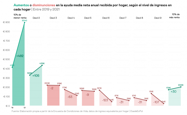
At this point, the key question seems obvious: What has happened among the poorest households so that they have fared so well compared to the rest of Spanish households? To try to answer this question, we can look at the average net income per household per year from social assistance, a category that essentially comprises the different regional minimum incomes and, as of 2020, the Minimum Vital Income (IMV). It should be noted that these values are the average for all households, i.e., they include households that do not receive any of these benefits at “zero” and, therefore, give us a picture of how the interaction of the coverage rate (the percentage that does receive assistance, i.e., that is not at zero) with the average level of benefits has varied among those households that do receive them. In other words: it is a picture of the full effect of the policy. Households in the first decile have doubled their average welfare income.
However, it remains to be answered what has motivated this increase: an increase in the % of households receiving these minimum incomes/IMV (i.e., the rate of coverage of this type of assistance)? Or perhaps this % of people has remained constant and what has increased is the generosity of these benefits?
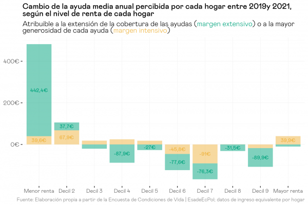
To answer this question, we decompose the increase we saw in the previous graph into the two components mentioned above, the increase in the coverage rate of benefits (extensive margin) and the increase in their generosity (intensive margin). To do this, we simply simulate what the change would have been between 2019 and 2021 if the coverage rate had remained constant, which allows us to know what part of the increase corresponds to each component. In the following graph we can see that, of the €482 increase we observed in the previous graph for decile 1, €442 can be explained by the growth in the percentage of households receiving any of these social assistance incomes. Similarly, a large part of the drops observed in the intermediate distribution brackets can also be attributed to this mechanism, but in the form of a drop in the coverage rate.
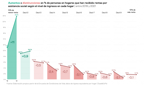
The following graph shows the magnitude of the increase in the minimum income/IMV coverage rate between 2019 and 2021. Specifically, in 2019 as few as one in ten households in the top decile received these benefits at some point during the year, compared to 22% two years later. This increase was at least partially offset by the sharp relative drop in coverage rates in the middle brackets of the distribution, particularly between deciles 4 and 9. Overall, this represents a readjustment of the minimum income system in Spain in the right direction, focusing benefits on the households that need them most.
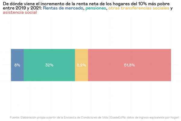
Finally, now that we are clear on the reasons for the increase in social assistance income of the poorest households between 2019 and 2021, it is worth putting into perspective how much of the total increase in the income of these poor households that we saw in the first graphs can be explained by the growth in social assistance income. To do this, we first decompose the growth of equivalent income into the changes in net household income and the average consumption units of each decile, which shows that the vast majority of the growth in equivalent income of the poorest 10%, which we saw in Figure 3, is explained by the growth in household income: 12 percentage points out of 13. The following figure shows how much of the increase in net household income is explained by different concepts: market income, pensions, social assistance and other social benefits (mainly unemployment and disability). The results indicate that slightly more than half of all the income growth of the poorest households can be explained solely by the growth of their social assistance income, while the second most important component would be the growth of pensions (32%) which, again, may be due both to an increase in the percentage of pensioner population within poor households and to an increase in the generosity of retirement benefits. On the other hand, the increase in market income, made up of labor and capital income, plays a residual role and barely accounts for 8% of the total growth in the income of poor households, the same weight as the rest of the public benefits.
All of the above allows us to draw valuable lessons about the behavior of household income in Spain in one of the most important periods of its recent history. On the one hand, we can see that, most probably thanks to programs such as the ERTES, the final impact of the pandemic on household income was rather modest, with the exception of the poorest households. These, in turn, recovered strongly in 2021 and managed to increase their income considerably with respect to 2019 while the remaining households, which experienced a considerable increase in income in nominal terms, lost purchasing power when we adjust for the strong inflation of 2021. Decomposing the increase in social assistance income allows us to better understand the causes of the increase in income of poor households in that period: it was mainly the higher coverage rate between 2019 and 2021, rather than the increase in the generosity of benefits, that contributed to slowing income erosion.
These data should be taken as a sign of the success of Minimum Living Income as a new public policy: at a time of unprecedented emergency it served to halt income erosion for those who could have been most affected, to the point of rebounding even in real terms. But this success should be put in context: if it was the higher coverage rate that was responsible for this success, and if according to the latest information published by the Airef this rate has fallen back in 2022 compared to 2021 for households eligible to receive it, we should also understand the data presented here as a reason to prioritize the effort not only to stop any fall in the scope of the policy, but to directly increase it.
Similarly, these data tell us that between 2019 and 2021 there was a generalized impoverishment in real terms of Spanish households, with the exceptions of 20% and 10% of households with higher and lower incomes respectively. Despite the fact that, given the circumstances, the final balance of the 2019-2021 period could have been much worse, we cannot ignore that, in 2021, most households, many of them at the lower end of the distribution, had not yet recovered the purchasing power they had in 2019.
Footnotes:

Related content